

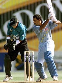
The Black Caps revealed some swanky new uniforms yesterday, complete with high tech fabric, Man City-style loadsamoney sponsor, microfibre panels and goodness knows what else.
I’m underwhelmed. I like black and clean lines. This one has neither, and heralds a return to New Zealand Crickets’ worrying willingness to embrace grey. It’s not Beige. The best I can say is it’s it’s better than some of the crap we’ve had (there’s further discussion on sporting uniforms at Hadyn’s new digs).
Any design process has a few draft versions and false starts along the way, and I can now reveal the rejected designs, exclusively leaked to sportreview.net.nz in a hotel carpark on the back of a sausage roll. Behold.

Somehow Styris still makes his look worse.